Redecorating your workplace can be a momentous task and there is much to think about when you are choosing that all-important color scheme. Color can be a powerful tool, and studies have frequently shown that different colors can affect our behavior and emotions in different ways. With the average employee spending up to nine hours a day in their office environment, this would suggest that your office décor decisions can have a significant impact on your team and their productivity.
What is color psychology?
Color is ultimately light and it is just part of the spectrum that we are able to see, and color psychology refers to the study of how different hues can influence our mood and behavior. The idea dates back thousands of years, with the Ancient Egyptians believing that certain colors had healing properties. The concept is often confused with color symbolism, which was explained in depth by the Swiss psychologist Carl Jung. The two ideas are certainly inter-related, with symbolic meanings of color also influencing people’s psychological reactions.
Color psychology has been particularly popular amongst interior decorators, graphic designers, and marketing teams, with many companies utilizing the color spectrum to convey the message that they want to communicate. Smart employers use everything that they can to keep their team on track, with many considering how colors can help them to achieve their business goals, how they can impact employee productivity and ultimately achieve the business’ objectives.
How can color affect our moods?
Theory regarding the psychology of color indicates the way in which different shades can trigger certain moods or behaviors. For example, warm colors such as yellow, red and orange have the potential to be comforting, whereas, cold colors such as green and blue are said to have a calming effect. Furthermore, when colors are too bright, they can be overstimulating, whereas a lack of color can have a melancholy effect.
However, the idea that a singular color can emit the same emotion into each individual does not allow for the subjective nature of the subject. In fact, different people may interpret different colors in different ways. For example, some people may see red as a sign of warning or danger, whereas others may correlate this color with passion and desire. When you are selecting your office color scheme, it is also advised that you keep the personality of your brand in mind, as well as the psychology of color.
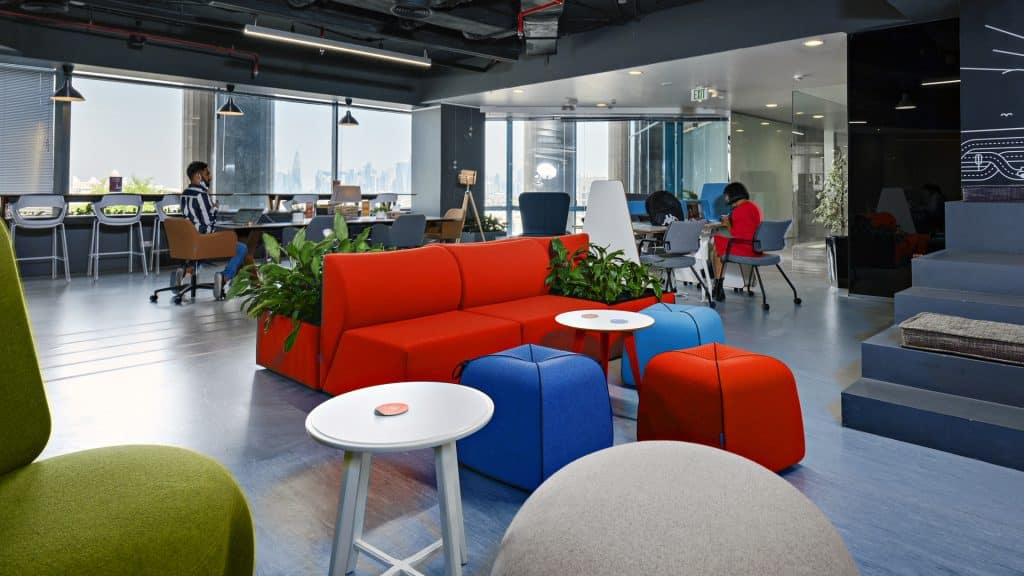
Red
Red is a strong bold color that can even have a physical effect on our bodies, such as increasing our heart rates. In the workplace, red is associated with higher levels of productivity, and it has even been reported that red walls can make people feel that the time is going by quicker. Red can be a great color for a fast-paced office but it may not be suitable for a workplace where high levels of concentration are needed to complete the task. It is a stimulating color with overuse also being associated with increased anxiety but it can be effective when used as an accent, or in areas where you do not want people to gather.
Blue
Blue is said to stimulate the mind, lower the heart and improve concentration. Depending on the shade used, it is a color that promotes tranquillity and serenity. Blue also demotes a sense of trustworthiness and competence, making it popular for companies such as financial institutions and insurance companies. This is particularly apparent when darker shades of blue are used, as this can indicate professionalism. However, too much of a darker or cooler shade can have a gloomy effect on individuals and potentially even reduce productivity.
Yellow
Yellow is the color of sunshine and happiness. It promotes vitality and offers an energetic and fresh element to your office décor. It is also reported to stimulate mental activity and it is a particularly effective color for a creative workspace. However, a bright shade of yellow should only be used sparingly, as too much of this can be overwhelming. Moreover, yellow has also been known to increase appetite.
Orange
Creating a sense of fun, orange is a highly energetic and enthusiastic colour. It is a happy hue, which can promote feeling of vitality. It is the colour of teamwork and inspiration, but it can also be overwhelming if used too much. Furthermore, orange can also signify a warning of potential danger. Yet warmer shades of orange, such as terracotta, can be comforting and calming.
Green
Green is often used to symbolize nature and tranquillity or growth and renewal. It is a soothing color that is reported as being excellent for decision making and stimulating creativity. Olive shades of green are well suited to libraries and research rooms as they can enhance focus and concentration. With the ability to inspire yet remain calming and relaxing, soft shades of green are said to be able to reduce anxiety and green is also the best color for resting our eyes. However, you may want to stay away from darker shades of green as this may produce a gloomy effect.
Black
Black the absence of light and it is often considered an oppressive color. However, it can be powerful when used appropriately. For example, adding small black accents can provide depth to your room and is particularly effective when used in a simplistic design. From a Feng Shui perspective, black is associated with concepts such as power, mystery, and opulence.
White
White is a fairly flexible color and it is an effective base color. It tends to be the main color used in hospitals, dentists and doctor’s surgeries as it indicates feelings of cleanliness and sterility. However, in an office environment, white is notorious for eye strain, and it has even been suggested that employees are more likely to make mistakes in an all-white workspace.